Lighting is not just about brightness — it’s also about the feeling it creates. The same room can look completely different — warm or calm — depending on the light’s color tone, which is determined by its Correlated Color Temperature (CCT). This temperature is measured in Kelvins (K), and it defines whether the light appears warm, neutral, or cool.
Studies show that choosing the right color temperature can make a noticeable difference in mood, reduce eye strain, and even boost productivity. According to the U.S. Department of Energy, proper lighting can improve workplace performance by up to 16%, while cooler lighting (between 5000K and 6500K) helps increase alertness and focus.
Whether you’re designing lighting for a living room, setting up a product display, or enhancing your office environment, understanding CCT gives you the ability to make smarter choices for comfort, efficiency, and visual clarity.
In this guide, we’ll explore what CCT means, how it’s measured, and where to best use each color temperature for optimal results.
The concept of color temperature originates from 19th-century physics and the study of blackbody radiation. In 1860, physicist Gustav Kirchhoff introduced the idea of a perfect blackbody. In 1900, Max Planck developed the blackbody radiation law, showing how heated objects emit light that shifts in color from red to white to blue as temperature increases.
This discovery led to the creation of the Kelvin scale, named after Lord Kelvin (William Thomson), which became the standard for measuring color temperature. As electric lighting evolved from incandescent bulbs in the 1870s to fluorescent lamps in the 1930s and LEDs in the 1960s, the lighting industry began using Correlated Color Temperature (CCT) to define the visual tone of white light.
Today, CCT is a critical specification used to design and select lighting for residential, commercial, and industrial environments.
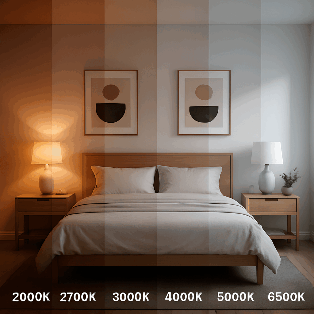
Different CCT levels influence not only the mood of a space but also how colors appear and how the environment feels overall. Even at the same brightness, warm light can make a room feel comfortable and welcoming, while cool light tends to create a brighter, more focused, and clinical atmosphere.
Understanding how each color temperature looks — and where it performs best — helps in selecting lighting that complements both the aesthetic style and functional purpose of a space. Below is a breakdown of common CCT ranges and their visual and emotional impact:
| CCT (Kelvin) | Light Tone | Visual Effect | Common Uses |
|---|---|---|---|
| 2200K–2700K | Very Warm White | Cozy, intimate, relaxing | Restaurants, living rooms, bedrooms |
| 3000K | Warm White | Comfortable, calm | Residential lighting, hotel rooms |
| 3500K–4000K | Neutral White | Balanced, clean, natural | Offices, retail spaces, schools |
| 5000K | Cool White | Crisp, energizing | Hospitals, workshops, garages |
| 6000K–6500K | Daylight White | Sharp, blueish, focused | Studios, outdoor security lighting |
Each CCT range influences not only the visual appearance of a room but also how people feel, focus, and perform within it. Warm tones are ideal for creating a relaxing atmosphere and encouraging rest, while cooler tones enhance alertness, visibility, and concentration.
CCT affects how you feel, how you work, and how well you relax. The color of your lighting can shape your mood, energy, and comfort.
Choosing the right light color at the right time improves how you live every day.
Selecting the right color temperature isn’t just about aesthetics — it’s about creating an environment that supports comfort, focus, and well-being. When you understand how CCT works, you can use light more intentionally to enhance both mood and performance in any space.
Key Benefits of Choosing the Right CCT:
Enhanced comfort: Warm light creates a cozy and relaxing atmosphere, while cooler tones promote alertness and clarity. Matching the tone to each space sets the right mood and energy.
Improved focus and productivity: Cooler CCTs in work or study areas help reduce fatigue and maintain concentration over longer periods.
Healthier daily rhythm: Warmer light in the evening minimizes blue light exposure, supporting better sleep and a natural circadian rhythm.
More accurate lighting design: Understanding CCT helps you harmonize artificial light with natural daylight, wall colors, and furnishings for a cohesive, visually balanced look.
Smart lighting flexibility: Modern LED systems allow adjustable CCT, giving you dynamic control to shift the atmosphere from warm and relaxed to bright and focused with ease.
By applying CCT principles thoughtfully, you can make your home or workspace look better, feel better, and function better — transforming light into a powerful tool for comfort, productivity, and design.
CCT and CRI are both lighting terms, but they measure very different things. CCT tells you the color tone of the light (warm or cool), while CRI measures how accurately that light shows the true colors of objects.
Here’s how they compare:
| Term | Stands For | What It Measures | Scale | Use |
|---|---|---|---|---|
| CCT | Correlated Color Temperature | The color appearance of white light (warm to cool) | Kelvin (K) | Helps set the mood or atmosphere |
| CRI | Color Rendering Index | How true colors look under a specific light source | 0 to 100 | Important for color accuracy (e.g., art, retail) |
Example:
A 3000K light provides a warm and relaxing ambiance, but if its Color Rendering Index (CRI) is low (below 80), the colors in the room may appear flat or unnatural. In contrast, a higher CRI rating (90 or above) ensures more accurate and vibrant color representation, even at the same CCT level.
Understanding both CCT and CRI helps you choose lighting that not only looks appealing but also performs effectively in your environment.
A LIGHTING EXPERINCE LIKE NO OTHER